In a rut? Colour your way out.
We’ve all had those days where we fail to summon forth the spark of creativity. But how long you stay in a creative rut depends on whether you simply wait and ride it out, or you actively take steps to bust through.
Setting yourself a limitation challenge is one way to bust free of a creative block. The brilliant thing about imposing limitations is that it frees you from the pressure to create something perfect in every way. You can now simply create within the limitations you’ve allowed for yourself.
A Colour Challenge is one such liberating limitation exercise.
Begin learning flower photography today with Kathleen’s flagship course, Flower Portraits. Kathleen is an award winning photographer, teacher and author who is internationally recognised for her workshops. Fun fact, she also goes by the title “the Lobster Lady” - see her interview on our blog for more!
The colour challenge is one I personally enjoy, because I love the way colour can impact or express mood. You can read Ute Reckhorn’s (a.k.a California Lover) treatise on that same topic in her own blog post here.
The colour challenge is also an easy one to help you shake off your creative block because you can photograph colour anywhere.
Your home, your garden, on the way to work, at the park…literally anywhere.
Whether you choose to look for the interplay of complimentary colours or search for just one colour in a scene, try to seek out what is interesting in the world based solely on the properties of colour.
Telling yourself “I’m only going to look for colour today” might liberate your mind from seeing the imperfections in your composition or stressing over your technical shortcomings. Which could result in more creative images.
You don’t need to set out with a specific subject in mind. Let colour itself be the subject and seek it out wherever you happen to be.
Victoria Andrews is a kiwi living in Australia. A talented portrait photographer, Victoria draws on her long history as a dancer and dance teacher to infuse her images with evocative emotion. Victoria teaches Making a Portrait, Concept to Creation. Register now - starts 1 November 2021.
Photograph colour in your everyday
Are you currently stuck in the confines of home? Look for colour in your everyday environment.
If you’re worried that your home environment is too drab, or too cluttered, you could try deliberately de-focusing or incorporating motion blur for a more abstract image. Or you could just embrace the pops of colour you find in the most simple aspects of in everyday life.
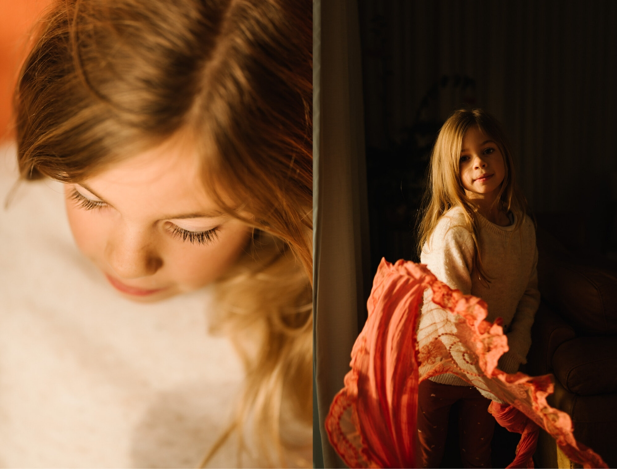
Like the cheerful sparkle of bright pink dress-ups I captured here.
Aimee Glucina is a born and bred kiwi who doesn’t take herself too seriously, swears a little too often and firmly believes real is better than perfect, every damn day. Aimee teaches The Authentic Storyteller, a workshop for improving your everyday storytelling. Starts 18 October, register now.
Not a “people photographer”? Try colourful flowers.
If you have a macro lens, get out into the garden and look at nature’s colour cues.
Can you let colour guide you into creating an abstract floral masterpiece, like this one from “Flower Portraits“ maestro Kathleen Clemons? Search out enough beautiful garden hues and you could quickly find yourself with enough custom made content to fill your own 12 months of blooms calendar in all the colours of the rainbow.
Kathleen’s top tip for enhancing the colours in your flower photography is to fill the frame with your subject so that the color is edge to edge throughout the frame. This is also the easiest way to eliminate any possible background distractions.
Kathleen Clemons teaches Flower Portraits, Flower Portraits the Sequel, and iPhone Flower Portraits.
Be your own muse with self-portraiture.
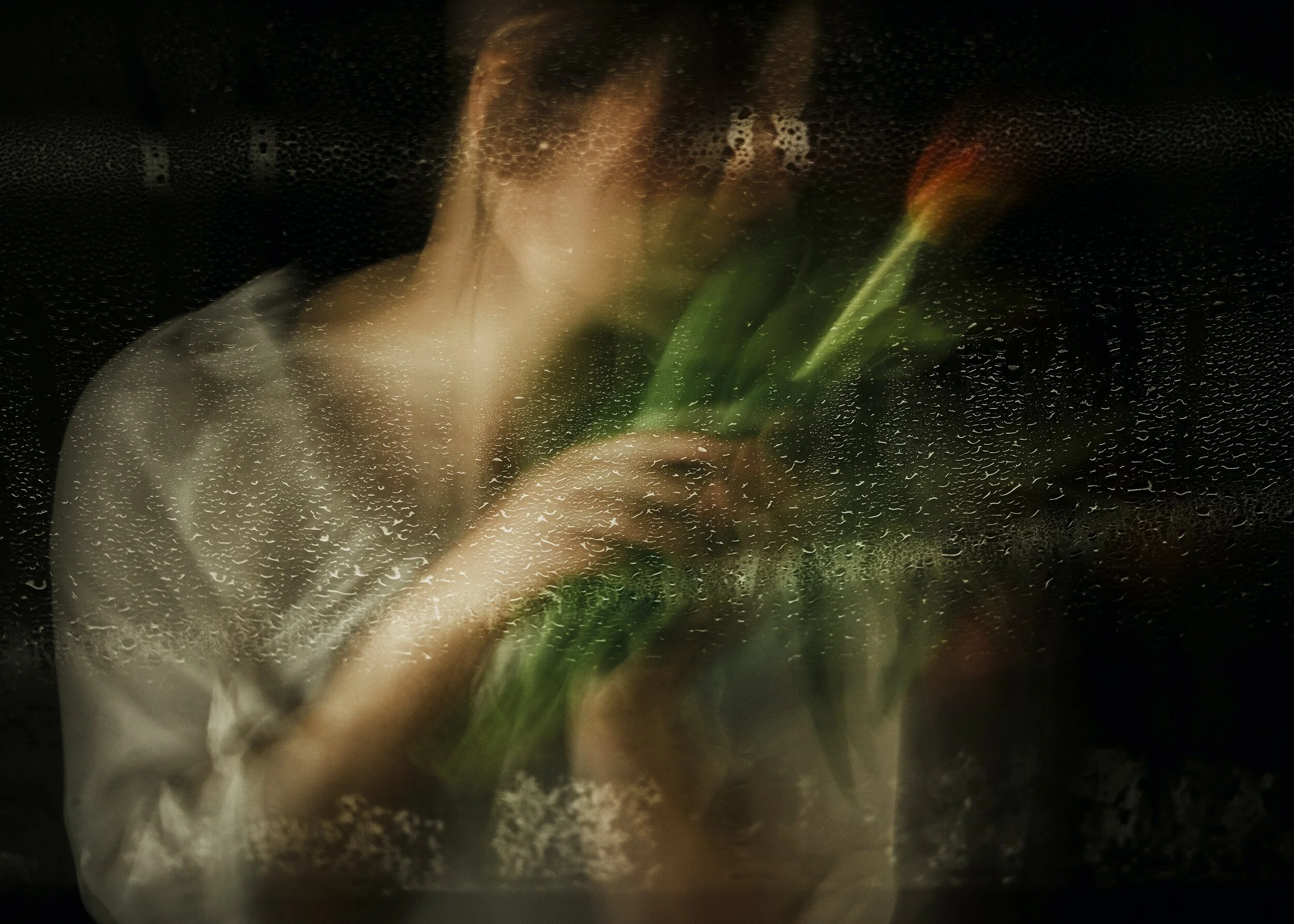
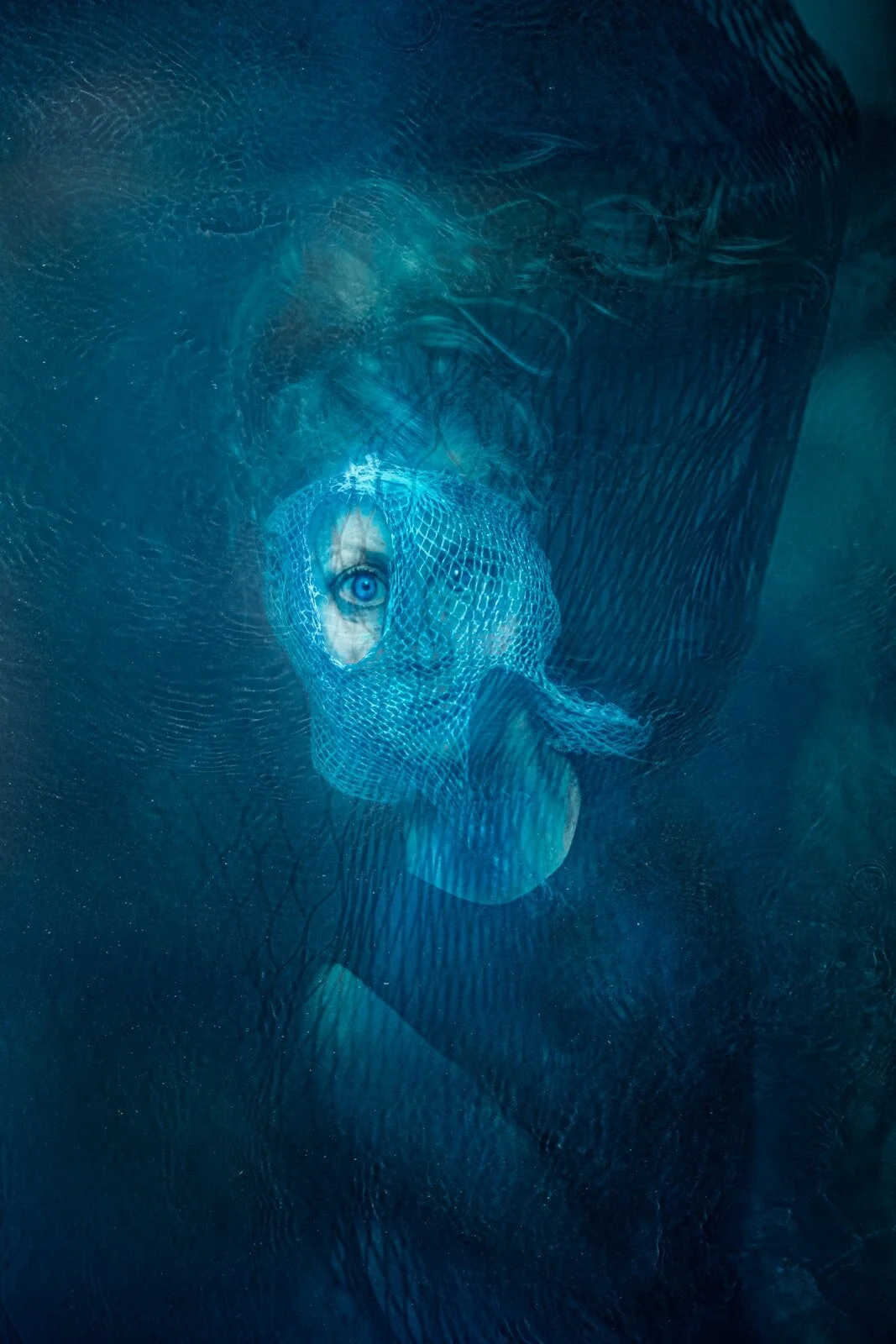
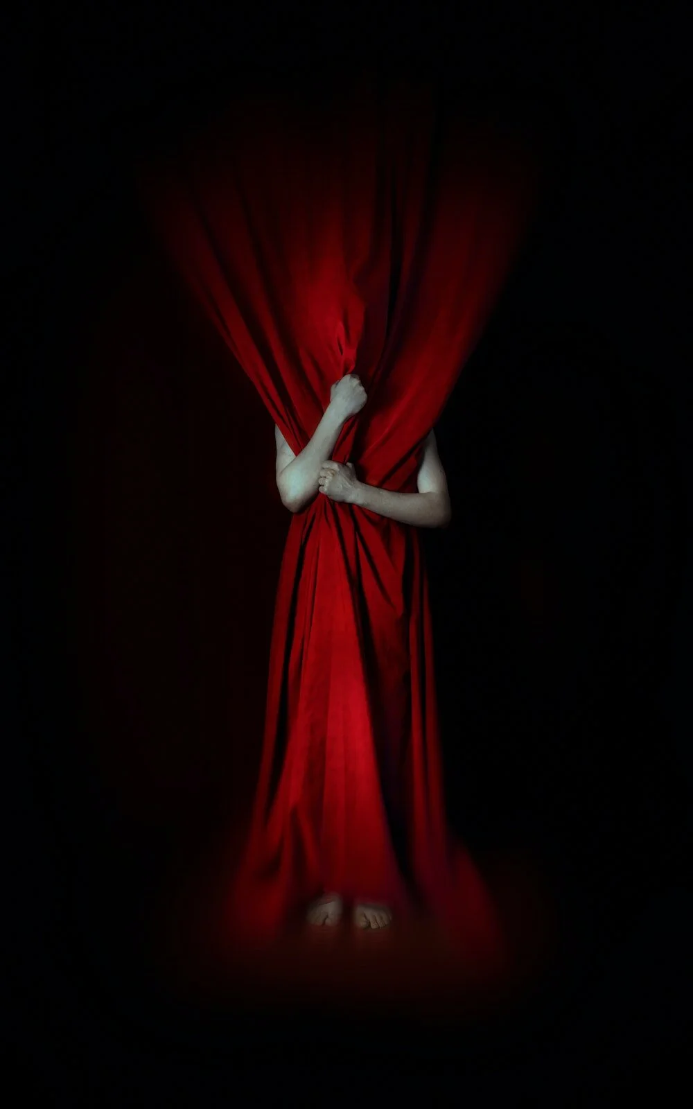
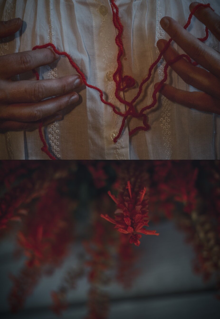
Incorporating colour into a self-portrait can be a brilliant way to convey your emotions or express the mood of the day.
Observe the power of passionate reds, regal purples, calming blues, or joyful yellows. Which colours are you drawn to today? Do they mirror your energy or mood? See how colour can change the feeling of your self portrait dramatically.
Look at how Manuela Thames uses colour here for the artistic expression of emotion in her self-portraiture.
Manuela Thames is an internationally exhibited artist who explores self portraiture as a form of catharsis. She teaches you how to create self-portraits in her Fine Art Self Portraiture course.
April Milani is a lifelong student of art who loves to experiment boldly. In her course “The Colour of Emotion” April explores how colour can be used to make powerful, scroll stopping portraits.
Experienced self-portrait super star April Milani says “Colour is capable of making the simplest of set ups become so powerful.” She’s a huge advocate for understanding the colour wheel and how colour theory impacts the art you make.
“I love to use colour to create emotion and make you feel as though the surreal could possibly be real.”
Try your hand at colour-filled double exposures.
In this double exposure portrait I was led by the vibrant and dreamlike colours of a moody sky. I layered them in camera over a self-portrait that contained complimentary hues. Look for colours that compliment each other and will work well when blended. Remember that the light areas of one image will stand out against the darkest areas of the second image.
Have twice the fun with colour focused photo diptychs.
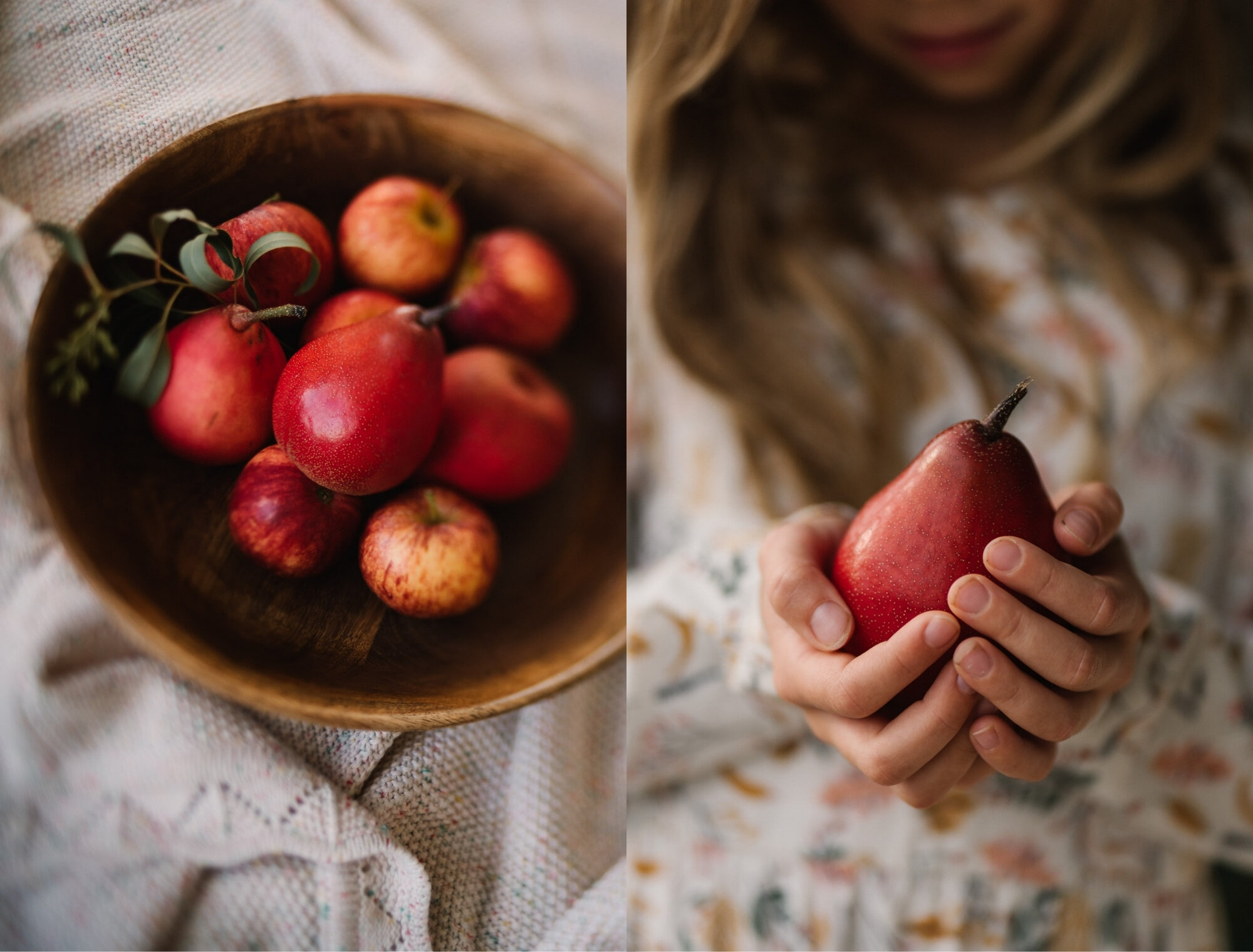
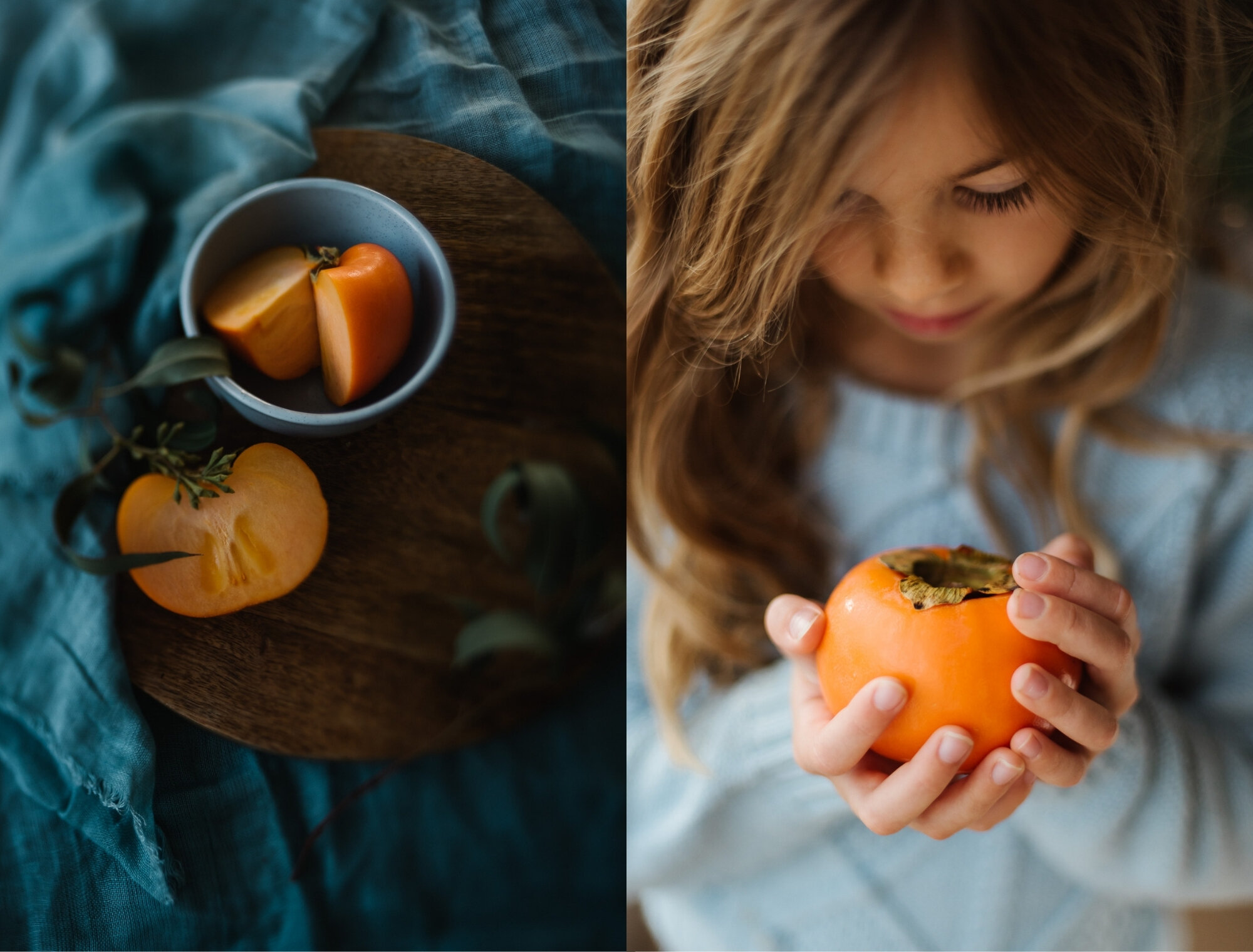
How about doubling down on your colour exploration by creating a diptych based on the colours you find?
Pick a colour and then find it’s complimentary hue for the other panel. Or choose two different subjects linked solely by their colour. Does the colour you choose impact the mood of the diptych? Do you start to find more things to photograph once you focus in on just one colour?
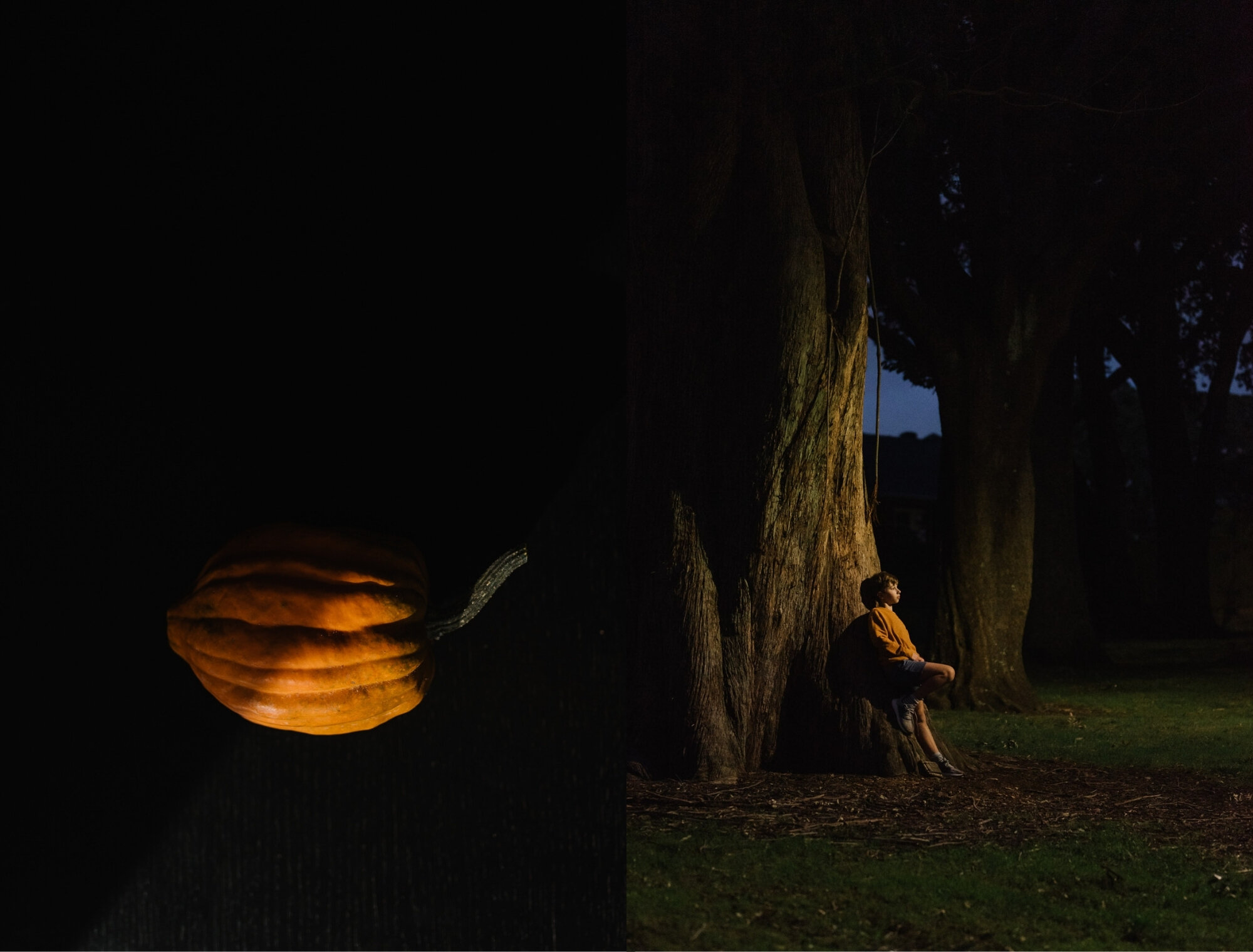
Use pops of colour for unique portraiture.
Feeling like there’s nothing new in your portraiture?
Try looking for creative ways to add just a splash of colour. Whether that’s with props, clothing or even face paint – get creative with colour and see where you end up.
Remember that colour can express mood, and different colours are imbued with a variety of meanings or feelings.
Pick a colour and try incorporating it in a portrait in as many different and unique ways as possible.
Something as simple as the tiny splash of colour against an otherwise neutral palette is what brings the whole concept together in this striking portrait from child portraiture guru, Victoria Andrews.
Want to learn how Victoria comes up with her awesome portrait concepts? You can, in her course “Making a Portrait”.
Don’t forget to edit for colour too!
The colour play doesn’t have to end with the shooting either. You could further challenge yourself to think in advance about how you will manipulate the colours you shoot in post processing.
Take the before and after examples below from Natalie Finney. This portrait was shot with the deliberate intention of using colour manipulation in the background to produce harmony. Look what a differnce those complimentary colours make to the overall feeling of the image. Shoot for colour, and edit for colour too!
The Colour Grading chapter of Natalie and Helen’s “Photoshop Skills Expansion” looks at the basics of colour theory, the difference between colour correction and grading, and how to draw inspiration from classic cinematic colour grading schemes in your own work.
Natalie Finney is an awarded Australian portrait photographer and self confessed Photoshop nerd. She is one half of the dynamic duo that teaches both Photoshop for Beginners and The Photoshop Skills Expansion.
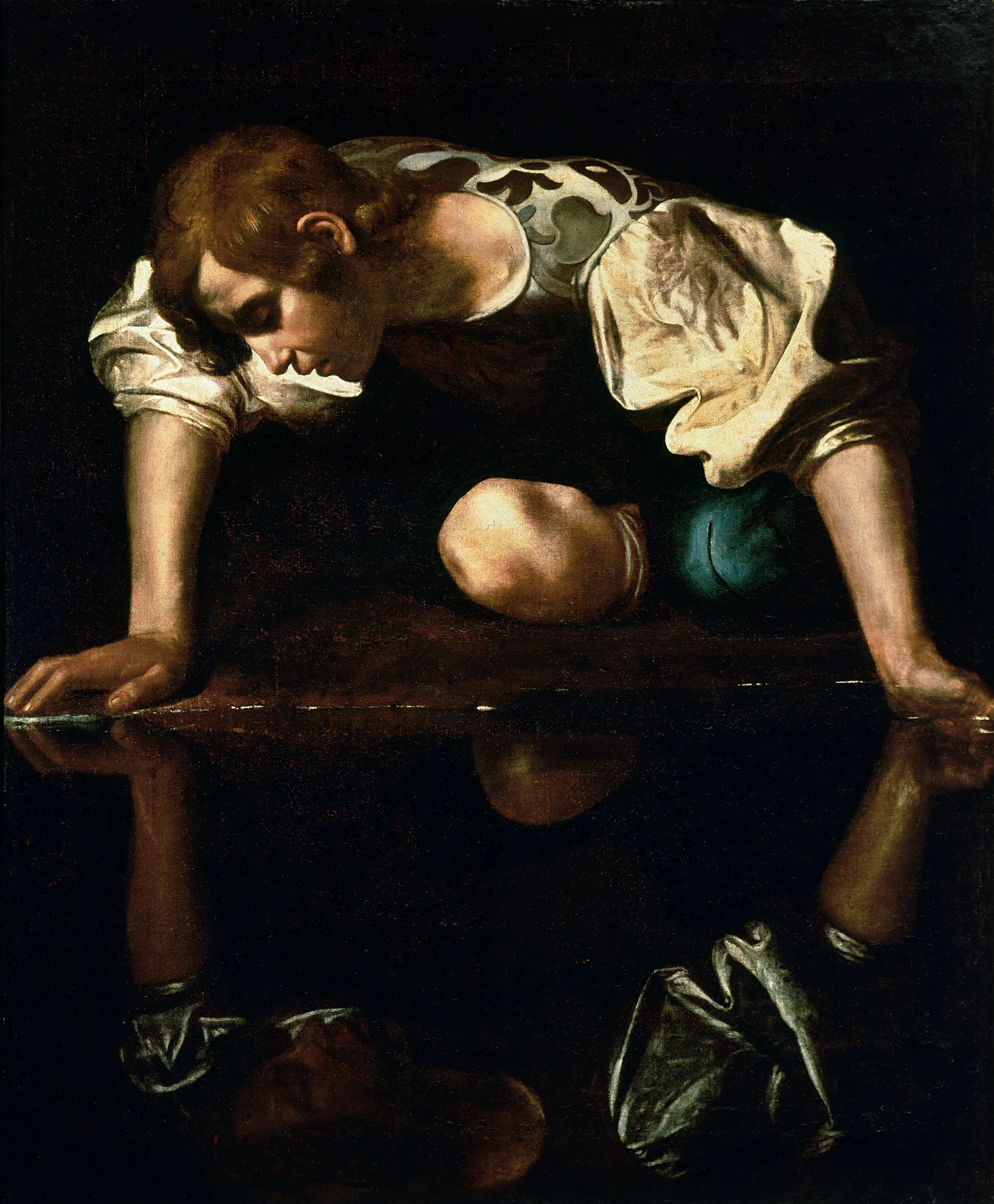
Draw colour inspiration from the masters.
Colour is truly all around you, but if you’re still struggling to zero in on it in your everyday surroundings then there’s nothing wrong with pulling a page from art history and seeking inspiration in the work of the masters.
Choose an artwork with a palette you love as your reference image and look to replicate its tones in your own image. You could do it in camera or you could explore colour grading in post-processing to map the reference images colours onto your own work. Just as Natalie did here, using a technique taught in “The Colour of Emotion”.
Editing to bring out the full power of colour is not for the faint of heart either. There’s a whole world to unlock if you’re prepared to dive deep into seeing what adding a little colour can do. Look at this incredible “before and after” transformation April achieved all using Lightroom brushes and colour!
Before her incredible transformation.
After, edited to add colour in LR. See how April does it in “The Colour of Emotion”.
Monochrome is still colour.
Helen Whittle is perhaps best known for her stunning black and white photography. If you, like Helen, tend to be drawn to the drama of a black and white conversion, don’t be afraid to push the boat out and look for the most subtle hues. Sometimes the barest hint of colour can make a beautiful impact.
Helen Whittle is an award winning Australian photographer (and Vet - although we’re not sure she’s won awards for that?) who teaches the Photoshop for Beginners and Photoshop Skills Expansion with Natalie Finney.
If you’re looking to try this limitation challenge, or just have some fun with colour, why not join the October Gather Master’s Monthly theme – Colour Pop!
Share your images in the Gather Master group or on Instagram using the tag #gmaster_cpop for the month of October!
We’d love to see what you can come up with when you’re inspired by colour.
Want to learn more about one of the courses mentioned in this article? You can check out all our available online courses with the click of a button here.
Author: Aimee Glucina
Aimee teaches our storytelling workshop The Authentic Storyteller. Launching again on 18 October 2021 - register now!


